Consent Dark Patterns: Why “Reject” Must Be as Easy as “Accept”

Summary
A consent dark pattern is a banner or form designed to push people toward agreeing, by making “accept” prominent and easy and “reject” hidden, small, or slow. Regulators enforce it as a compliance problem. Under the GDPR, withdrawing consent has to be as easy as giving it. Under the CCPA, agreement obtained through a dark pattern doesn’t count as consent.
The reason this matters is that a dark pattern can make a non-compliant site look compliant. The banner is there, the reject option exists somewhere, and the numbers still show almost everyone “agreeing,” because the design did the persuading.
The sections below define what counts as a consent dark pattern, set out what the law requires, and walk through a regulator example, the CALOGA fine. They finish with the part of a dark pattern you can measure, and how to check your own consent design.
What counts as a consent dark pattern?
The common thread is asymmetry. Accepting is one obvious click. Rejecting takes more effort, more clicks, or a harder-to-find control. Familiar examples include a bright “Accept all” button next to a greyed-out or buried “Reject,” toggles that default to on, a “Reject” that is worded to sound like losing something, and withdrawal of consent that is far harder than granting it was.
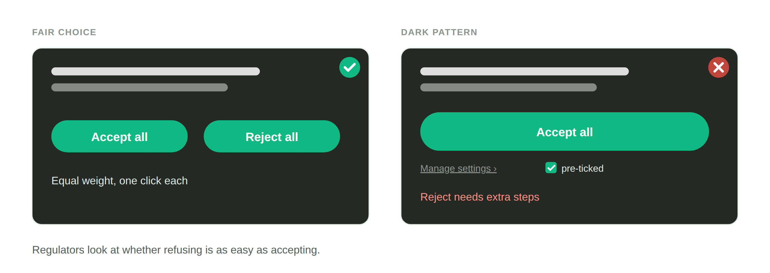
None of these removes the choice outright. They tilt it. That tilt is exactly what the law addresses, because consent obtained through a rigged choice does not meet the “freely given” standard.
What the law requires
Under the GDPR, Article 7 requires that consent be freely given and that withdrawing it be as easy as giving it. A banner where accepting is one click and rejecting takes five does not meet that bar, and neither does a site where turning tracking off later is buried.
Under the CCPA, agreement obtained through a dark pattern doesn’t count as consent. The law defines a dark pattern as a user interface designed or manipulated with the substantial effect of subverting or impairing user autonomy, decision-making, or choice.
A regulator example: the CALOGA fine
In May 2025, France’s data protection regulator, the CNIL, fined the data broker CALOGA 80,000 euros, finding that the data-broker forms it relied on, entry forms for game contests and online product tests, were designed so that accept buttons dominated the refusal links, so consent to email marketing was not free and unambiguous. Withdrawing consent also required sending an email. In the regulator’s words, “It was therefore not as easy for prospects to withdraw their consent as it was to give it.”
The case was about marketing forms rather than a cookie banner, but the pattern is the same one a cookie banner can show: a choice that is present but rigged. “Dark pattern” is our label for it. In the US, the CPPA’s 2025 order against Honda describes a cookie tool where accepting all took one click and opting out took at least two. Our Enforcement Watch hub tracks US cases like it.
The part of a dark pattern you can measure
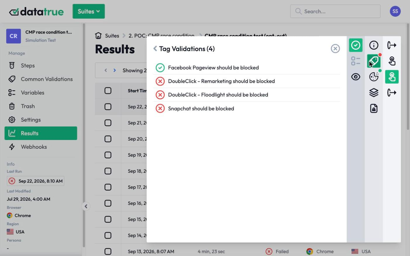
Some of a dark pattern is visual, a design review question of whether reject is as prominent as accept. But a large part of it is functional, and that part is testable. Two of these failures show up in behavior and can be tested directly. A toggle that defaults to on may fire its tags before the visitor ever chooses. And a “Reject” button may be present but not actually stop the tags it claims to, so the visitor declines and the tracking continues anyway.
Those are not design opinions. They are measurable facts about what your tags do.
How to check your consent design
DataTrue loads your site in a real browser and tests the functional half of consent design. It confirms whether any tag fires before the visitor makes a choice, including from a pre-selected toggle, and whether clicking “Reject” actually stops the tags it is supposed to. The result is a record showing that a rejection is honored and that nothing is pre-consented, which is the evidence that your banner’s choices are real rather than decorative. Pair it with a design review of whether reject is as easy to find as accept, and you have covered both halves.
Questions
What is a consent dark pattern?
It is a consent banner or form designed to steer people toward agreeing, by making “accept” easy and prominent and “reject” hidden, slow, or discouraging. Under the GDPR and the CCPA, consent obtained this way is not valid, because a rigged choice is not freely given.
Does “reject” have to be as easy as “accept”?
Under the GDPR, yes in effect: consent must be freely given and withdrawing it must be as easy as giving it, which regulators apply to the balance between accept and reject. In California, agreement obtained through a dark pattern doesn’t count as consent under the CCPA.
What was the CALOGA case about?
France’s CNIL fined the data broker CALOGA 80,000 euros in May 2025, finding that the data-broker forms it relied on were designed so that accept buttons dominated the refusal links, so consent to email marketing was not free and unambiguous. The CNIL also found it was not as easy to withdraw consent as to give it. The case involved contest and product-test entry forms rather than a cookie banner, and the underlying pattern is the same.
How do I know if my consent banner is a dark pattern?
Part is a design review of whether reject is as prominent as accept. The measurable part is behavior: whether any tag fires before the visitor chooses, and whether clicking reject actually stops the tags. DataTrue tests that functional half so you know the choice is real.
See what your tags do in every consent state
DataTrue loads your real pages as a visitor who accepts, rejects, or sends an opt-out signal, and reads what each tag sends. A tag that ignores the visitor’s choice shows up in a test.
- Every page, with coverage scans
- Scheduled runs, with alerts when a result changes
- Full journeys, like checkout and signup, in each consent state
- What each tag sent, field by field
- PII detection with test personas
- iOS and Android app testing
- Pre-publish testing for GTM and Adobe Tags
- REST API, plus Slack and Jira alerts
The full platform, every feature, free for 30 days.